Punk gets fresh | Mike Joyce & Swissted
I first contacted Mike Joyce of Swissted and Stereotype Design back in 2013, when I started my very first version of wtoi. He graciously gave me permission to use his words and images. I love reading and looking at them now as much as ever.
Mike JoycE & SWISSTED
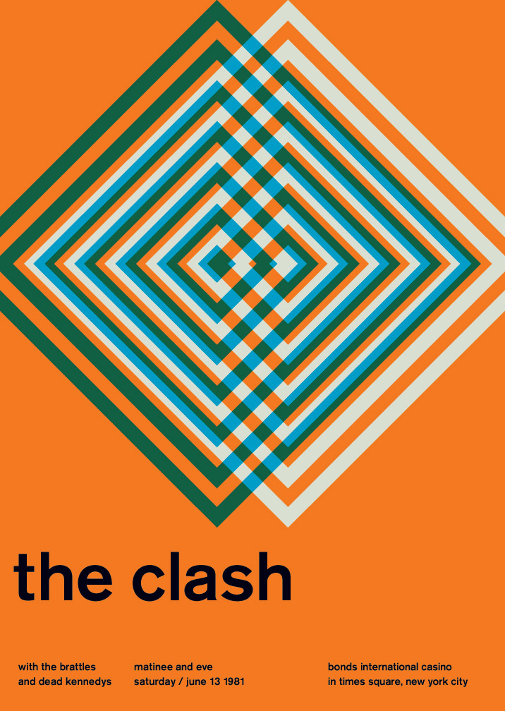
New Yorker Mike Joyce founded Stereotype Design in the West Village in 2002 and has created album packaging for artists such as Iggy Pop, Katy Perry, The Lemonheads and Aretha Franklin. In 2012 he laid his punk heart on the table with Swissted.com, a personal project that re-imagines old show flyers into hundreds of International Typographic Style posters. Here he spills to us on his passion for Swiss graphic design and punk rock.
Mike, punk is obviously a big thing for you. What punk rock bands did you listen to growing up?
I was born in 1972 and was only a couple years old when Television, The Heartbreakers and the Ramones were getting started. So I would obviously get into those bands much later on. Even though I grew up in Upstate New York where a lot of the NY hardcore bands would play, I was much more interested in the LA stuff like the Germs, Black Flag, Fear, Circle Jerks, Bad Religion, Channel 3 and the Orange County bands like The Crowd, Adolescents, Agent Orange, Social Distortion, and D.I. Flipside Fanzine was my bible as a kid and was a nice escape from the bland suburbs. I was addicted to anything the Posh Boy label would put out and was thrilled when Robbie Fields gave me a nice quote for the book. Other bands I grew up listening to were Minor Threat, Dead Kennedys, Hüsker Dü, Minutemen, the Replacements, Misfits, Generation X, the Clash, Chron Gen, Sex Pistols, Bad Brains, Descendents, Jawbreaker, and of course the aforementioned all-time great Ramones.
What is it about punk rock music that captured your interest?
For me, the most interesting thing about punk was that it challenged the mainstream’s preconceived notions. Punk was all about thinking for yourself and rejecting the status quo and this really spoke to me at a young age. I grew up where everyone seemed to have the same house, same car, same job at General Electric, and I never wanted any of that. Things like punk, art, and even skateboarding taught me that there was something else out there and that I could do whatever I wanted to in life.
Where did you get the idea for 'Swissted: Vintage Rock Posters Remixed and Reimagined’?
Basically punk rock and typography are my two favourite things. I grew up completely inspired by punk, new wave, and indie-rock and would later find that same inspiration in Swiss graphic design—more specifically the International Typographic Style. I always liked that these two movements seemed at odds with one another in that punk has an anti-establishment ethos and Swiss modernism is very structured. And at the same time there’s a common thread between the two—the Swiss modernists purged extraneous decoration to create clear communication, while punk rock took on self-indulgent rock and roll and stripped it to its core. So I thought it would be an interesting study to combine the two and see what happens. I really like how both art forms contrast and complement each other.
You've created hundreds of Swissted posters — which are your favourites?
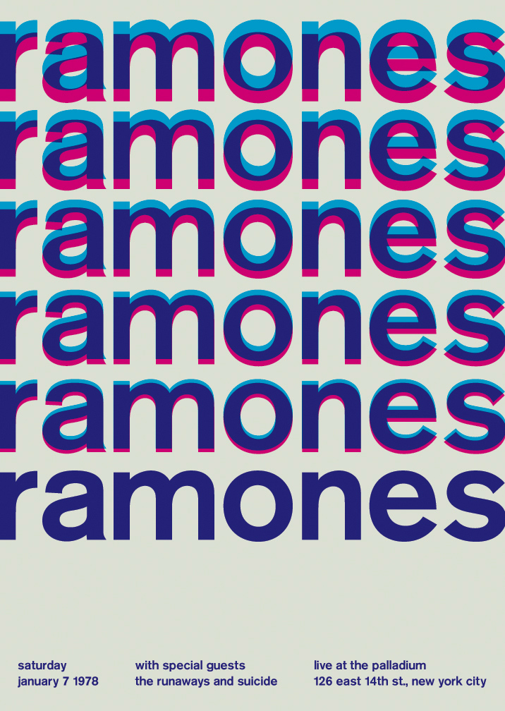
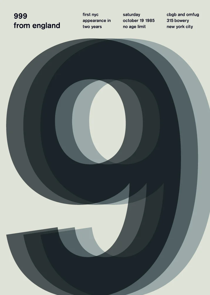
It’s always tough for me to single out just a few because there are a lot of elements throughout each poster that I like, but if I had to choose based on the design, I guess I’d pick the poster I did for the British punk band 999. I really like the illusion of movement that the multiple overlays create and how it forges one unfocused nine out of three. And the three hulking numbers give the poster a lot of presence. I also think it’s a good example of what you can do with the limitations of black and white. And then there are others that I love for their incredible lineups like The Runaways and Suicide opening up for the Ramones at the Palladium in 1978 or the Minutemen and Descendents opening up for Black Flag at the Cuckoo’s Nest back in ‘81—three of my all-time favourite bands under the same roof of a legendary punk rock venue.
What is it about the Swiss graphic designs and typography that you find so fascinating?
It’s funny, I have a bunch of Swiss posters hanging in my apartment from the greats like Josef Muller-Brockmann, Armin Hofmann, and Emil Ruder and I could stare at these things forever, whereas that might bore the hell out of someone else. I think it’s how minimal yet effective they are. They somehow achieve perfect communication through abstraction. It’s kind of the opposite of how things are done today.
“I hope people are inspired to see differently. I think Swissted is a tribute to the true independent spirit of punk in that it shows there’s not one specific way in which things should be done.”
What do you hope people will get out of looking through your book?
I hope people are inspired to see things in a different way. I like that there are some people who love graphic design but know nothing about punk rock, others who love punk but know nothing about design, and then there are those who love both. And I think Swissted is a tribute to the true independent spirit of punk in that it shows there’s not one specific way in which things should be done.
Can you tell us one thing that has inspired you, whether it be today, this week, month, or in your lifetime…?
I grew up constantly drawing as a kid and painted all throughout art school while I was studying design. Here’s a short list of the painters that have inspired me the most: Willem DeKooning, Philip Pearlstein, Franz Klein, Vernon Courtland Johnson, Chuck Close, Robert Longo, Ellsworth Kelly, Alex Katz, Edward Ruscha, Andy Warhol, Jasper Johns, Robert Motherwell, Roy Lichtenstein, Edward Hopper and Raymond Pettibon.
Buy the Swissted book now from amazon.co.uk or amazon.com.
See more Swissted.com here
© All Images Mike Joyce
“Basically punk rock and typography are my two favourite things. I grew up completely inspired by punk, new wave, and indie-rock and would later find that same inspiration in Swiss graphic design.”


